Wednesday 23 October 2013

Album Cover

Front cover #1

 I chose to use images of Ke$ha as my artist as she is similar to the artist that I am trying to show in my final production. The cosmic background was used in order to showcase fun and a supernatural element to pop music, which is the genre I am going for - being pop and dance music. The colours for the font does not clash with the background and is clear to the audience who the album is by.
Back Cover #1

 Similarly for the back cover I used a cosmic background and showed the artist in the left hand side of the cover, although the colour of the stage costume is the same colour as the background it does not contrast and appear invisible. I am choosing to use the font in this cover as it reflects my artist as it appears to be a wild font with capital letters and sharp effect. As an improvement I would have to ensure that the cover is the right dimensions of the back cover but also include record label logos.
Front Cover #2

This was my first attempt at photoshop and I chose a simplistic white background and positioned my artist in the centre of the cover and the official logo placed next to her. In order to improve this cover I would use a background and make my photoshopping more defined to ensure that there are no background from the previous picture in the new cover.The picture that I used appeared squashed to the dimension, I would make sure that my photo is big enough to fit the cover.
Back Cover #2 


  I want my cover to feature a trashy like theme therefore the use of glitter fully identifies this, I want my model to have messy hair, the cover to feature a party type theme with bottles on the floor - emphasising that my artist is the party queen. I again used the font in the previous cover as it embodies the theme I am trying to show.

Friday 11 October 2013

Album Cover Analysis


 The cover for Britney Spears' new single 'Work B**ch' and the theme throughout the image is Las Vegas - where she will be residing for 2 years. The typography is very modern and spaced out, interestingly her logo of her name has changed throughout her career, this depending on the album or it's theme. You see the main image of Britney Spears dressed in a risque showgirls outfit to fit with the theme, but the use of sex appeal with her chest out could entice the audience to be interested in the song/video - the use of sex sells and appeals to the audience. The backgrounds links with the foreground as it is a dressing room with props like; a harlequin crown, whip, pearls and feather boa. Glitter is used heavily in this cover on the table and mirror to again create a showgirls esque feel with the theme of performance running throughout. High level lighting is used surrounding the mirror to give it more of a professional performer feel, but generally low key lighting is used - high key lighting surrounds Britney to give the impression that she is a superstar performer. 


American singer/songwriter Ke$ha released a remix album titled 'I am the dance commander + I command you to dance: The remix album', the cover of this had heavy influence from her debut album 'Animal' and EP 'Cannibal' as lots of photoshop was used to create a cosmic theme in the background - this emphasises the technicolor element surrounding Ke$ha. The main image is of Ke$ha on a sofa with an inflatable flamingo and sword with the background draped in multicoloured streamers, again the idea of sex sells is used as she is again dressed in risque clothing and has the word 'Party' written on her arm to emphasise the genre and her public image of being a party girl/wild child. The use of glitter is put all around the image to strengthen the party theme but also let the audience identify Ke$ha as one of her trademarks is glitter. Low key lighting is used around the main image but high key lighting is used around the main image to highlight Ke$ha as the main selling point of the album as she is a familiar face to the audience. Ke$ha uses a glitter font for her logo but in this instance it is a simple font but a cyan colour on her name and her lipstick.  

https://blogger.googleusercontent.com/img/b/R29vZ2xl/AVvXsEgFO9n1tDft58SPJQcv-rX8GgJH0JySVrWnSbvr-jlqgjuibNUYMYiSsZYIOtWxm3i7C2imyxa3klFCa6ThAXkXedZJcFwguZmjPX0xe_ExOA6rrJV2rtd6nG2rcIHblJROW8UBS9Mw3Fc/s1600/teenage+dream.JPG 

 The cover for Katy Perry's sophomore album 'Teenage Dream' features the singer nude on top of clouds made to look like cotton candy - as this was a recurring theme for the album as the booklet and CD were infused with a cotton candy scent. The typography for the album name is stylized to be a candy cane colour and design in order to emphasise the candy theme throughout the album. The soft pink colour of the clouds link in with the genre being a bubblegum pop album and all the songs have a reflection with the cover and it suggests that this album is a magical album - having a strong connection to the Candyland board game and 'Candyfornia'. The  artists name and logo is a red colour which has the connotations of romance and love - which the songs are mainly about love and breakups. As the main image of the cover is a portrait of the artist, high key lighting is used to highlight the artists body and clearly show her body, the nudity relates to the sex sells idea which is why she is nude as this creates controversy and this generates publicity.   

http://i1.cdnds.net/13/41/618x618/music-album-artwork-lady-gaga.jpg 

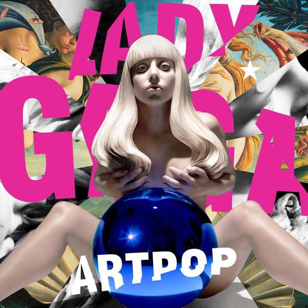
Lady Gaga's new album cover for her upcoming project/album ARTPOP features a range of pop art inspired paintings like The Birth Of Venus. The cover was created by America artist Jeff Koons and a design - the blue ball suggesting a metaphor for the Earth - was created specifically for this album cover as Lady Gaga and Jeff Koons now have heavy involvement with each others work. Intertextuality plays a key role in this cover due to the references to Sandro Botticelli and Jeff Koons, but also the Andy Warhol pop art inspiration. The main image is not actually the artist but it is a recreation of the artist by Jeff Koons, the sculpture of Lady Gaga and the ball are iconic to Jeff Koons' work. The use of her body can also be used as a publicity stunt as her hair is placed over her breasts - this again will generate more attention and publicity- the high key lighting emphasises the body . Her logo has changed over the process of her albums with this logo being bold and in a bright pink colour typical to pop art colours. The sculptures eyes are fixed onto the audience to engage them but to also be a main identifier for the album as Lady Gaga is known internationally. 
 
http://viz4u.net/blog/plus/cover/Welcome%20to%20the%20Dollhouse.jpg 

  The sophomore album from multi-platinum selling girl group Danity Kane titled 'Welcome To The Dollhouse' features all of the members sat in a white corridor positioned close to each other looking at the camera. The eyes of the members are directly facing the camera in order to engage the audience but to give a sex appeal to contrast with the white clothing which suggests purity. The use of the clothing being bra's and falling down clothes is sexual but also the use of hands on each other has connotations of sex and can appeal more to the male audience - for examples Aubrey's hand is placed on Dawns leg. The use of high key lighting emphasises the purity of the clothing but also can link in with the dollhouse theme of innocence. The logo of the band has never changed and has been a key selling point for the band as this is the identity of the band, the colour scheme changes with the albums in order not to clash with any colours. As the theme is dollhouse the girls represent the dolls living inside, some of the poses show this in order to look like they have been played with by a child - their music does contrast with this idea though for example songs like Striptease & Ecstasy.  

Friday 4 October 2013

Children's Magazine - Seventeen


Seventeen magazine is the first teen magazine to be sold in the United States, it heavily focussed on making girls become role models in citizenship but has now taken a more fashion and romance approach in order to compete with rival teen magazines. It is aimed at 12-19 year olds as it is a huge gap within the teen market, although its secondary audience can be style conscious early 20 year olds. Often teen idols are put on the cover to fit the age demographic it is trying to appeal too, majority genders that appear on this magazine is females but in some cases teen heartthrobs like One Direction will be put on the magazine to appeal the the girls buying it - this magazine primarily aims itself at females as apposed to males, but some males may buy the magazine if a certain celebrity is on the cover of it. Seventeen magazine has often been criticised for losing its original message of trying to promote female independence and self respect to become a fashion magazine, but also it has been publicly been slandered for its use of photoshop on cover models which it has apologised for. 

The masthead has become a iconic statement within the teen market and the colour of the font often changed to fit a certain style or to not conflict with the background or hair colour. The magazine is priced at $3.99 so it is not expensive for its viewers and is a monthly publication featuring current styles, beauty advice but also relationship advice. The cover lines of the magazine clearly show who the audience is with titles like 'Are you addicted to dude drama?' and 'Fun makeup'. Some people view some of the content as inappropriate for the younger audience as the magazine can be seen to promote certain subjects like weight loss or a striking heading on this magazine of 'Get pretty faster'. Real life stories are also put into the magazine to give it a more sense of reality with shocking stories of real life situations - like 'I was almost kidnapped on my way to school'. The graphics and typography is very bold to the audience and certain words are highlighted to give the magazine the idea that it will help you if you buy it, words like Pretty and Free are highlighted to instantly demand attention but also the '425 fashion tricks' makes the viewer interested in what they are. The main cover line again is aimed at the audience to buy the magazine as it suggests that if you read this 'secret' then you will never have a bad hair day again, the rule of three is seen as you clearly see the triple divide in the format. Plugs are seen on this magazine as apposed to Vogue and Playboy - it says 'Free bracelets' because it will attract people into getting the magazine just to get the bracelet. Although the magazine is not known internationally the magazine has used certain tactics to strengthen the magazines identity - by being the main sponsor for America's Next Top Model but also employing Kendall & Kylie Jenner as West Coast fashion representatives. 

Mens Magazine - Playboy


 Playboy has become one of the most iconic brands internationally starting from it's first magazine funded by the founder Hugh Hefner in 1953, featuring icon Marilyn Monroe. The magazine labels itself as a gentleman's lifestyle magazine and features nude pictorials from celebrities like; Kim Kardashian, Anna Nicole Smith and most recently Kate Moss. It has become a global brand and is now on every medium, some countries feature their own editions of the magazine but it is the American edition that has become the statement piece for iconography. The magazine was the starting point for the company which has now gone onto becoming one of the biggest brands, selling makeup, perfumes and clothes to the public. To add to the list of achievements that the company has made, various reality shows have been filmed in the notorious Playboy mansion - most famously Girls Next Door which centred around the lives of Hef's three girlfriends Holly Madison, Kendra Wilkinson and Bridget Marquardt. Hugh Hefner is the editor of the American edition but also founder of the company, he has gone onto becoming a celebrity in his own right from his job title but also scandals involving women and three girlfriends. 

The logo is the main identifier of the magazine and company and they also use a bunny as the trademark to be put on products which is recognisable to the public. The slogan of the magazine is 'Entertainment for men' which specifically states its primary audience of men, it also suggests that the magazine is an entertainment magazine. The cover lines again are very subject specific to the magazine and are very male orientated - for example 'The music and sex issue' & 'Aubrey O'Day breaks free of Danity Kane (and her clothes)'. The cover lines also centre around the main image to bring total emphasis to the body of the models, the typography is very clear and is multi coloured on certain issues but they are very bold and clear colours like reds and blacks. The main cover line is also very specific to the magazine - being 'Risque and famous sexiest celebrities of the year' - suggesting that the audience was allowed to vote their opinion of the sexiest celebrity. The slogan above the masthead - 'The Sex and Music Issue' suggests it has more importance as it is a themed issue which relates to the interviews and music theme running throughout - but also that cover girl Aubrey O'Day is a singer. The rule of thirds is seen in this magazine as it is separated into thirds but in this case the writing surrounds the main image to not derive attention away from the cover girl - her head overlaps the logo which again makes the eyes face the audience to engage them. Playboys main focus is to use curvy girls as apposed to other magazines (like women's magazines) that use emaciated models to showcase the magazine or products in the magazine. 


Female Magazine - Vogue


 Vogue magazine is an elite fashion and lifestyle magazine primarily aimed at women or fashion conscious people, originally an American publication the company has branched out to major countries. The magazine has become one of the biggest symbols in fashion, the magazine keeps its readers up to trend with current fashion by showcasing and attending fashion shows of what will be big in a certain season. The coveted September issue was made into a documentary style film to showcase the work behind the magazine. Celebrities are often used on the cover however editor Anna Wintour has often made it publicly clear who is allowed and who isn't allowed to be on the cover. Anna Wintour has become a celebrity in her own right following her job, appearing on the cover but also her status within the fashion industry. The company hosts a annual MET Ball Gala in which celebrities and people that are huge in the fashion industry attend. As it is a high end fashion magazine, it is priced between $15 - $20 and is a monthly magazine. 

  The masthead of the magazine is Vogue and has become a statement of fashion, the iconic font has also been featured on fashion shows and events to publicise the magazine and brand. In the magazine example of Emma Stone's cover, bright pink colours are used on certain words in order to bring attention too them, but some words like 'plus' and 'exclusive' are used to increase viewer interest in the magazine but also make you want to buy the magazine due to its exclusivity and content. As it is a high end magazine there are no generic plugs on the cover - as apposed to tabloid magazines like Heat which advertise free holidays. The typography is very elegant which is a reflection on the magazine, but also the cover rarely or never uses lower case letters as they want to bring as much attention to the magazine as possible. The main image (being of Emma Stone) uses the model to have her eyes directly at the audience to engage them into buying the publication. The cover lines directly relate to the fashion magazine mainly being about fashion and beauty tips as well as lifestyle tips, the magazine wouldn't necessarily use sex or relationship advice as they may view it as cheapening the elite brand. The magazine has been criticised in the past for the over editing of the models on the cover as it creates a negative impression for people that read it and can in extreme cases lead to anorexia/bulimia rise in teenagers. The use of nudity on the magazine differs from a 'lads mag' as it is done tastefully or with lingerie, a pregnant Claudia Schiffer appeared nude on the German edition of vogue, as apposed to fully topless covers seen by mens magazines - 'lads mags' are drastically cheaper than fashion magazines like Vogue & Elle.

Easy A


 Easy A is a teen comedy starring Emma Stone as intelligent teen Olive Pendergast who has a troubling and tarnished reputation. The film is set out in the quiet Californian town of Ojai which is the perfect setting to contrast with the craziness of Olive's reputation - as Olive decides to give what her audience is making her out to be, therefore she embroids a scarlet A to corsets. The film takes direct inspiration from the Nathaniel Hawthorne novel The Scarlet Letter, it was featured within certain scenes of the film - the original not the film adaptation as it is comically referenced throughout by Olive. Rumours are the main focus of the film mostly false rumours made up by her peers, including long term enemy Marianne Bryant who is strictly religious and believes that Olive should be expelled for her 'dirty skank' reputation - shown when rumours escalate to a mob of students (ran by Marianne) picketing for Olive to be expelled. Intertextuality has a huge role in this film with references to The Scarlet Letter & The Breakfast Club, there is a love story involved between Olive and her long term crush 'Woodchuck' Todd - she soon mends broken relationships and remends her reputation with a series of webcam filmed confessionals throughout the film.   
 
  The use of high key lighting is used throughout the film with certain scenes where Olives life spirals out of control are filmed in low key lighting to reflect Olives emotions, but it also makes the audience pity her. The setting of the school is easily identified by the audience as the location has generic school items like desks and lockers - this would relate to the target audience of teenagers as it is a teen comedy. In the beginning of the film a panning shot is used to pan down from the credits to the actual setting to set the scene, establishing shots are used immeadiately after to again show the audience the setting - closely followed by close ups of the school sign to allow the audience to see where the location is and to confirm that it is a school. When the group of girls bump into Olive the camera tracks down to her, you have a clear idea in your head who the main protagonist is of the film. Close ups of Olives face are used when Rhiannon and Olive are talking and focus pull is used to make the foreground (Olive) more important than the background of Rhiannon. The camera track paper that is blown in the wind to Mr Griffith which then the camera pans up to him - the use of high angle shots make him have authority and Olive seem weaker due to her position. Over the shoulder shots are used to make the audience have an involvement within the shot - as a lot of the film is shot using a webcam, close ups of Olive are predominantly shown, the use of the strong eye contact establishes a relationship between Olive and the audience. Non diegetic music is played at the start of the film - its upbeat to make the audience have a positive vibe about the film, voice overs are used when Olive is talking over a scene to give an autobiographical sense about the film.

Tuesday 1 October 2013

Great British Bake Off


The Great British Bake Off is a UK reality television competition consisting of amateur bakers fighting for the chance to be crowned star baker - a weekly award given to a baker for being the best in that particular challenge. As of series 4 the two judges were allowed to eliminate two people at one stage in the competition but generally one person is eliminated each week. The two judges are cooking royalty Paul Hollywood and Mary Berry and the show is presented by hilarious duo Mel Giedroyc and Sue Perkins - who provide comic relief at often tense scenes.  

The show primarily uses high key lighting to make the show appear more positive and family orientated. Colourful equipment and british flags are used to emphasise the positive and patriotic element of the show, but also the colourful equipment can sometimes contrast with the gloomy British weather. The start of the show often uses an arc shot/reverse arc to zoom in/out of the two presenters before showing last weeks episode with non diegetic voice overs talking about the highlights. This then cuts to the opening graphics - graphics are used a lot to show what the bakers are actually going to make. Focus pull shots are heavily used when on the food being made, they are also used on contestants when talking to other contestants of the judges/presenters - over the shoulder shots are used when talking to make the audience feel more involved in the scene. Interestingly high angle shots are used when there is a tense scene or stressful scene as it makes the audience feel a sense of power over the contestants when things go wrong - it is used when the baking process goes wrong and the contestants are stressed. As the format is a reality television show, cast confessionals are filmed using close ups so it is just their face and shoulders in the shot to keep fixed on any emotional detail that may occur. As the show tries to influence you into being proud to be british, establishing shots are used to show british scenery in their area, as the show like to play on patriotism with often British classic recipes. Conversations between the cast are diegetic sounds and they are generally the only diegetic sounds within the show, however non diegetic sound plays a huge role as voice overs talk about what a particular contestant will be baking, the process and also previous challenges. But also music plays a huge role as the show often uses upbeat music to again emphasise the positivity of the show and that it is family orientated, but also the music can change to very quick and light music in tense scenes - this makes the audience feel anxious and tense to what will happen.